Wird Neumorphism der neue Look für iOS 14? Fragt sich Charlie Sorrel von Cult of Mac. ↦
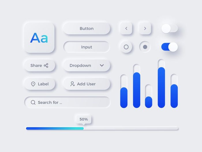
Unlike skeuomorphism, which mimics the physical world to an absurd, hyper-real degree, neumorphism adds a physical element to today’s flat UI paradigm. One look at the images in this post will tell you all about it. Subtle light effects, or shading, add texture and depth to a flat plane. Color is used sparingly, and judiciously, to make navigation easier. Never again will you look at a gray, label-like “button” and wonder whether it is on or off. You’ll know instantly, because it will be raised (or not) or colored (or not).
Schon Ende vergangenes und Anfang dieses Jahres poppte dieser Trend auf. Und mit Recht ist er in Sachen Accessibility nicht ganz unumstritten. Als Purist sagt mir Neumorphism generell schon zu, nur ist die Anforderung an die Gestaltungsqualität so hoch, dass wir wahrscheinlich viel Crap ertragen müssen, bis alle Designer den Stil einigermaßen drauf haben.