Marques Brownlee macht sich gewappnet mit Dummy-Modellen Gedanken, was alles im iPhone 12 stecken könnte, wie es aussieht und ob es auf der Kante alleine stehen kann ↦
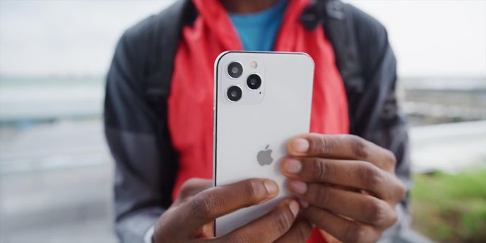
Ich dachte immer die Anordnung der Kameras in den Pro-Modellen des iPhone 12 wäre 2x2 – in seinen Dummies sieht die aber noch so aus, wie beim iPhone 11. Fehlt da nicht der Lidar-Sensor vom 2020er iPad Pro?