Willkommen im Weblog von Yves Luther

Erinnert ihr euch an die Szene in Interstellar mit dem schwarzen Loch? Habt ihr auch nie verstanden, was ihr da eigentlich seht? Dieses Video von NASA Goddard’s Scientific Visualization Studio hat es mir erklärt.

Closest to the black hole, the gravitational light-bending becomes so excessive that we can see the underside of the disk as a bright ring of light seemingly outlining the black hole. This so-called “photon ring” is composed of multiple rings, which grow progressively fainter and thinner, from light that has circled the black hole two, three, or even more times before escaping to reach our eyes. Because the black hole modeled in this visualization is spherical, the photon ring looks nearly circular and identical from any viewing angle. Inside the photon ring is the black hole’s shadow, an area roughly twice the size of the event horizon — its point of no return.

Todo: Interstellar noch mal mit den Töchtern gucken.

Jetzt hat Bundeswirtschaftsminister Peter Altmaier das ­Geheimnis gelüftet. "Deutschland wird einen Großteil des künftigen Bedarfs an CO2-freiem bzw. CO2-neutralem Wasserstoff importieren müssen", zitiert der Spiegel aus dem Entwurf einer "nationalen Wasserstoffstrategie". Dazu wolle man "Energiepartnerschaften" mit Erzeugerländern eingehen – sprich: mit Afrika oder Australien.

Übrigens: Wasserstoff wird primär aus Erdgas gewonnen. Soviel zum „sauberen“ Treibstoff.

Apple’s closed system to prohibit users from setting third-party apps as defaults was questioned last year during a hearing of a U.S. House of Representatives antitrust panel. Lawmakers pressed the issue of whether iPhone users can make non-Apple apps their defaults in categories including web browsers, maps, email and music.

Das mit den Drittanbietern-Standard-Apps unter iOS würde mich zumindest für meinen E-Mail-Client Canary freuen. Einen anderen Browser als Safari würde ich niemals unter iOS benutzen (okay vielleicht noch den Firefox). HomePods habe ich nicht.

Google is not a search engine, it’s an ad engine. You search to find stuff, they respond with a full page ad. This is so ludicrously user hostile that it’s only tenable when you operate a monopoly.

Der Twitter-Thread ist zwar schon etwas älter, aber die beschriebenen Praktiken von Google erinnern mich stark an Apples Monetarisierungsbemühungen für deren Services.

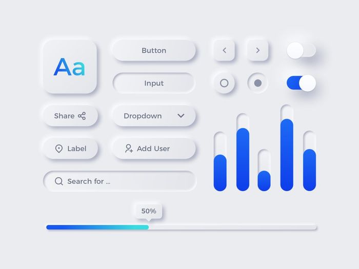
Unlike skeuomorphism, which mimics the physical world to an absurd, hyper-real degree, neumorphism adds a physical element to today’s flat UI paradigm. One look at the images in this post will tell you all about it. Subtle light effects, or shading, add texture and depth to a flat plane. Color is used sparingly, and judiciously, to make navigation easier. Never again will you look at a gray, label-like “button” and wonder whether it is on or off. You’ll know instantly, because it will be raised (or not) or colored (or not).

Schon Ende vergangenes und Anfang dieses Jahres poppte dieser Trend auf. Und mit Recht ist er in Sachen Accessibility nicht ganz unumstritten. Als Purist sagt mir Neumorphism generell schon zu, nur ist die Anforderung an die Gestaltungsqualität so hoch, dass wir wahrscheinlich viel Crap ertragen müssen, bis alle Designer den Stil einigermaßen drauf haben.

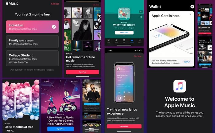
All that money comes from the wallets of 480 million subscribers, and their goal is to grow that number to 600 million this year. But to do that, Apple has resorted to insidious tactics to get those people: ads. Lots and lots of ads, on devices that you pay for.

Schon traurig, dass Apple als eine Firma, die angeblich nicht im Anzeigenbusiness ist, nun einen auf Schweinebauchwerber macht. Und wer weiß welche bösen Taktiken à la Google unter der Haube bei Apple gefahren werden.